Stock Analysis
Dashboard
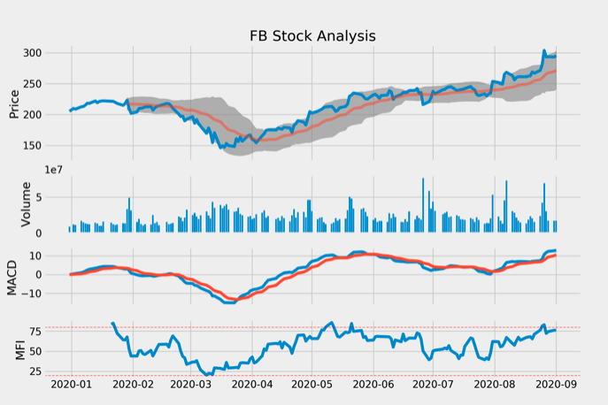
This is an interactive dashboard where users can pick a stock ticker, the date range and indicators. See it in action! Have a look at the code on my Github: Github
Libraries: numpy, pandas, matplotlib, searborn, yfinance, plotly, streamlit
Brief Overview:
Goal
- Create an interactive dashboard
- User can choose stock, time frames and indicators
Methodology
- Use of Streamlit to create the app
- Numpy and Pandas to calculate the indicators
Results(as of 03/26/2021)
- Dashboard is fully interactive
- Users can choose from the following indicators: Volume, RSI, MACD, MFI, Bollinger Band.
Challenges
- Implementation of the indicators without using financial python packages
- Make Interaction possible (free choice of indicators)
What did I learn?
- Dealing with Streamlit (turns data scripts into shareable web apps).
- Get to know different indicators related to the stock price
ToDo
- Implementing more indicators (stochastic oscillator, CCI momentum...).
- Using other visualization libraries
- Add notification when basic trading strategies are present
- Add recent news from the company
Introduction
The stock dashboard was my first standalone project, which I implemented with Python. There are many tutorials on the internet which show how to create such dashboards, but most of them are just static and don't let the user choose which indicators they want to have displayed. The interactivity was also the biggest challenge for me at that time.
Implementation of the App
A central part was the Python library Streamlit, which is used to create web apps relatively straightforward. In this project I came across Streamlit for the first time and without it I would not have been able to implement it this way.
Particularly interesting in the project was the work with financial specific indicators, of which I have heard before, but never knew exactly what they mean, or measure. Currently Volume, SMA, EMA, RSI, MACD, MFI and Bollinger Band are implemented. It was also a goal not to use a Python library for these indicators, but to write the implementation myself (with the help of some online articles it was quite feasible).
Besides the calculation I also spend time on the visualization. I used the standard visualizations libraries Matplotlib and Seaborn, in the future I want to design the visualization with Plotly to offer even more interactivity.